
- Project
A/B testing response rates for a form
- Role
- Lead product designer
- Stack
- Figma, Storybook, usertesting.com, A/B tests
- Year
- 2022–2023
- What I owned
- Research, component design, engineering partnership, test design, the shipped UI.
- What I shipped
- Component-led form with clearer errors, better mobile behaviour, and a Storybook library. 28% more completions; overall response +70% vs control.
Overview
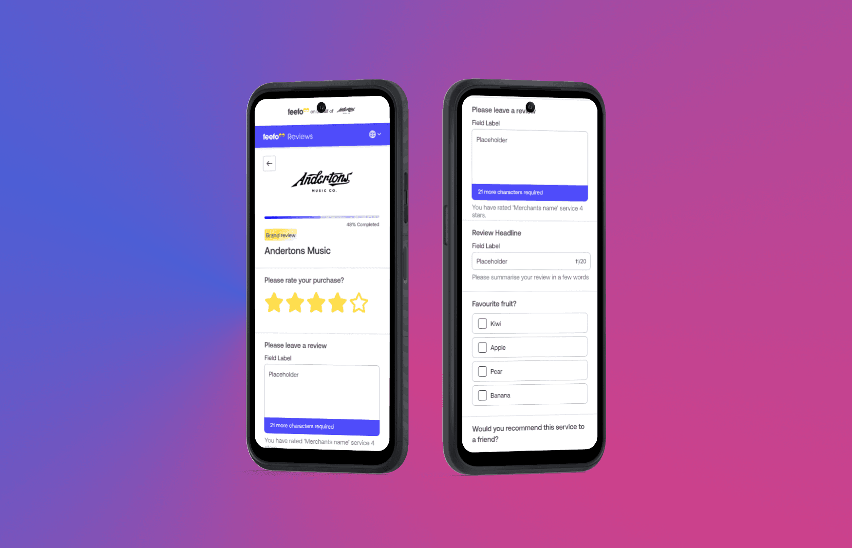
Email response had improved. Form completion had not. I led the redesign of Feefo’s review form so people who clicked through could actually finish.
The problem
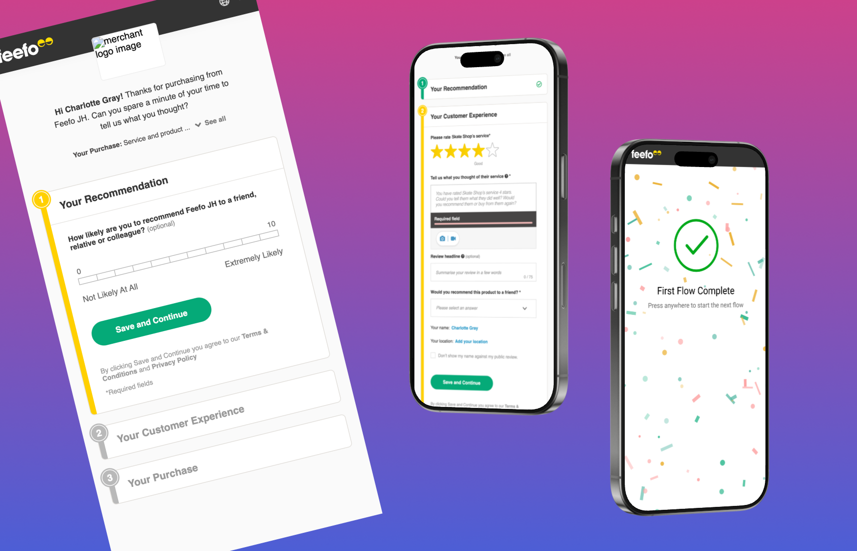
The form was cumbersome, weak on mobile, and fiddly in the details. Drop-off sat after the inbox. The email and the form did not feel like the same job.
The process
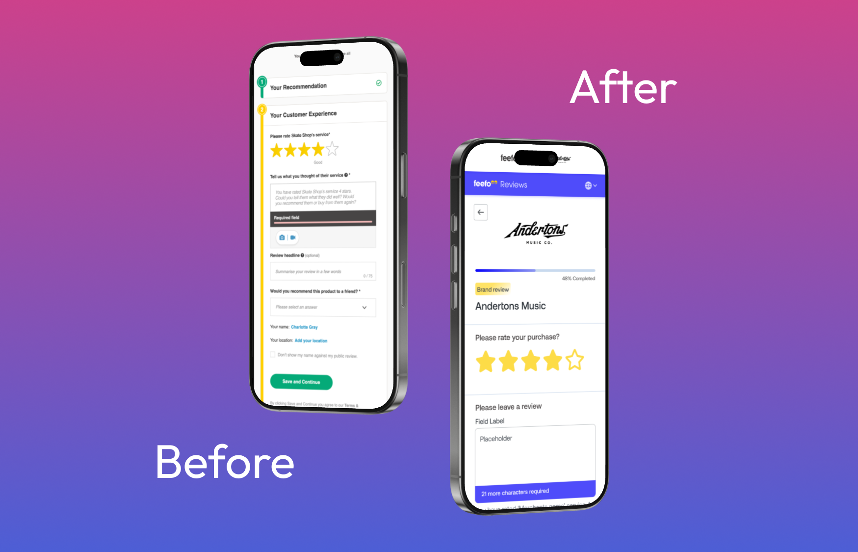
Quantitative drop-off and interviews on usertesting.com showed where people left. The redesign was a set of reusable fields, not a one-off layout: clearer errors, micro-interactions, load time, and a Storybook library. Engineering was in the work from the start. We A/B tested against a control.
Measuring success
The objective was a 30% lift in completions. We got 28%. Overall response rate reached 2.05%, +70% versus the original control.
Outcomes
A component-led form in production, usable on mobile, with a library other work could reuse. More completed reviews, not only more clicks from the email.